
Slackline Chicago
Nonprofit Rebrand & Website Design
Slackline Chicago (SLC) is a local nonprofit organization dedicated to bringing environmental care and creative movement to Chicago’s youth.
When I first started volunteering with SLC, they had a bare bones website with no branding and too much text.
First, I redesigned the website focusing on messaging and user experience.
I prioritized SLC’s most important goals (donations and social/newsletter signups) to organize the buttons and sections.
I simplified the wording and focused on key messages.
I upgraded the sitemap and the path to each new page for a more intuitive experience, including creating a Donate page to further SLC’s goals.
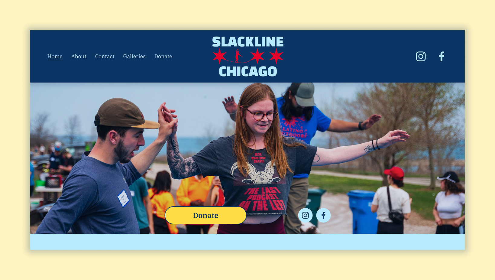
First section of Slackline Chicago’s current website.
Step 2: Create a cohesive brand and recognizable logo.
Slackline Chicago didn’t have a cross-platform identity and primarily used variations on the Chicago flag colors to represent the organization.
For a fun-loving, youth-focused nonprofit, I built a fun, flexible brand. Creating cohesion for all the company’s assets made them seem more trustworthy and sophisticated to their primary audience: parents.
With a unified color scheme and font, social posts, flyers, and stickers, are all recognizable as Slackline Chicago.
Slackline Chicago’s brand update.
Next up: Develop fun, engaging, on-brand assets.
SLC puts on different types of events and needed a variety of marketing materials to grow.
Based on their needs, I developed some templates to make it super simple for any team member to create on-brand assets, including
Local event flyers
Partnership pitch decks
Formal presentation documents
Informational instagram posts
Physical and digital advertising materials.
And onward…
My work with Slackline Chicago continues, and I will update this page periodically.
Check back soon!